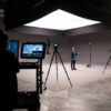
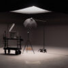
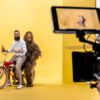
Most of the time when working on a project, the art director is trying to recreate the illusion of a place verbatim. That is, they’re trying to establish a location as accurate as possible. That’s what produces reality and keeps a viewer grounded. But what if we told you that it’s okay to not be so literal? That it doesn’t have to be an exact replica, that with a little imagination you can turn our studio into whatever you like. What would you do with it?
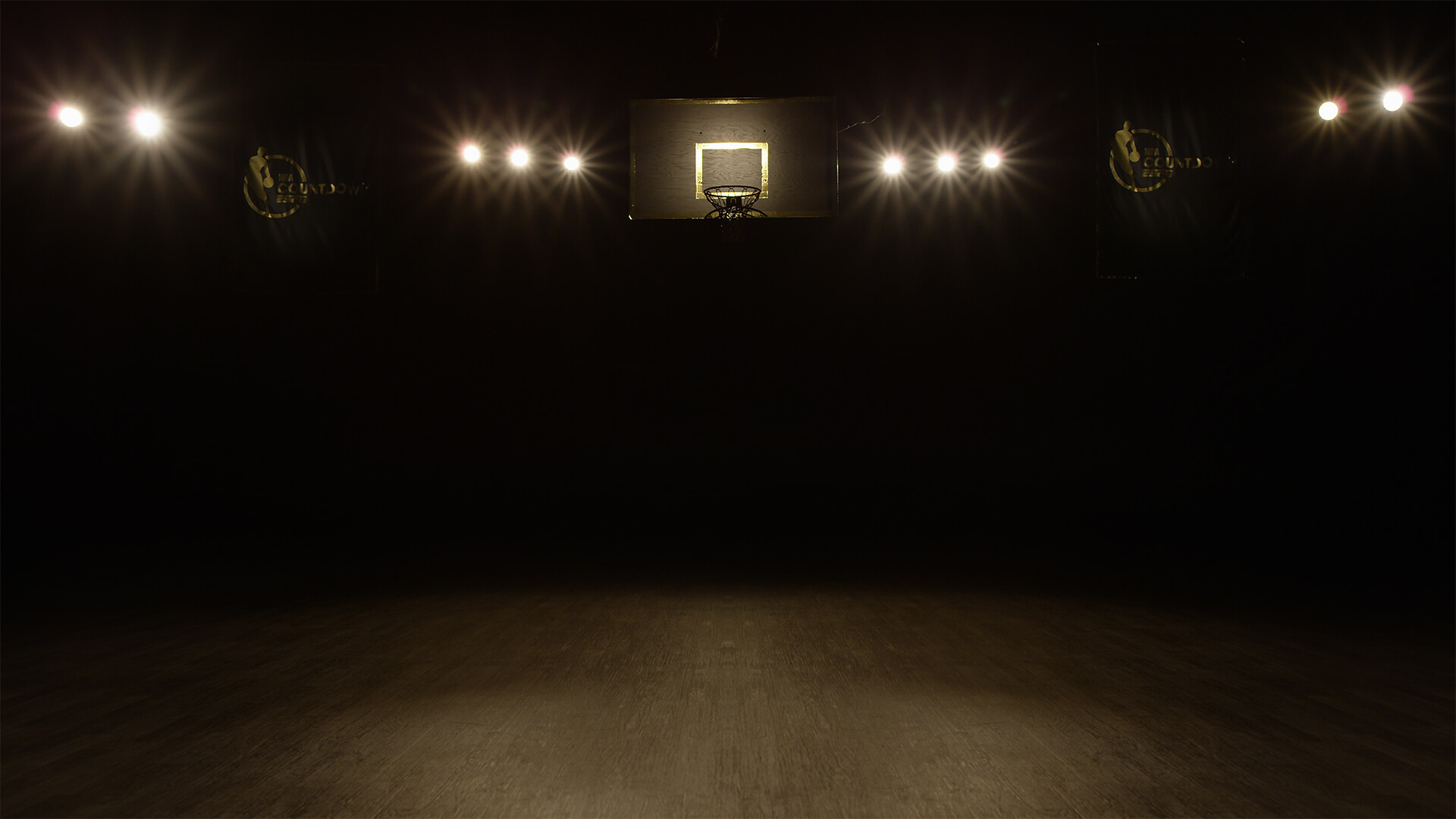
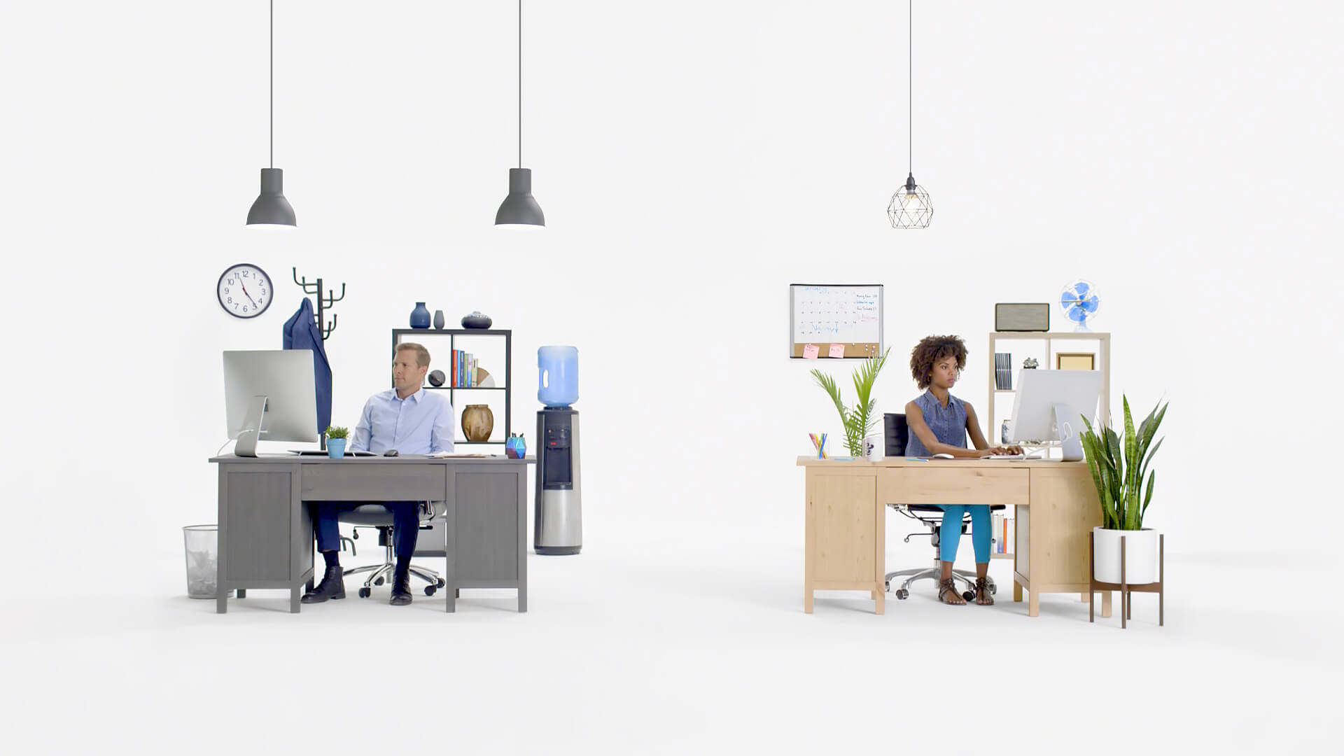
For instance, an art director set up a regulation basketball backboard turning our space into a half court. Another crew set up office furniture creating an office without actually being in one. What both of these projects had in common was an aesthetic, a look and feel that was complementary to the project’s visual goal.
Thinking Theatrical
Creating a sense of space reminds us of a theatrical show where a location can be defined by a few set pieces. The key to making it believable is to give the viewer something that they’re familiar with; set pieces must be representative of a place. They’ll be the anchor that allows a viewer to instantly identify the location. That’s the lesson we learned when a Canadian based marketing firm SDI Marketing and production company Roger Diaz Inc* rented out our studio for a Jack Links Canada commercial.
The Locker Room
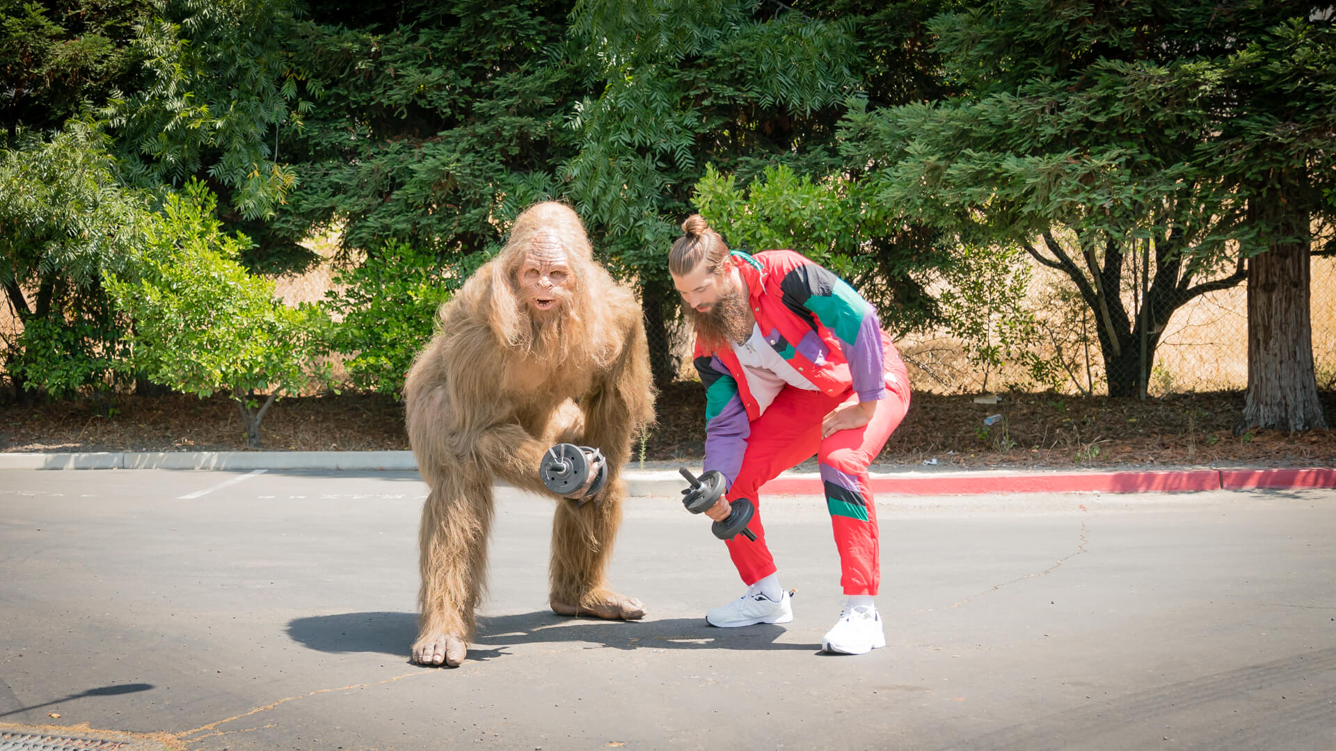
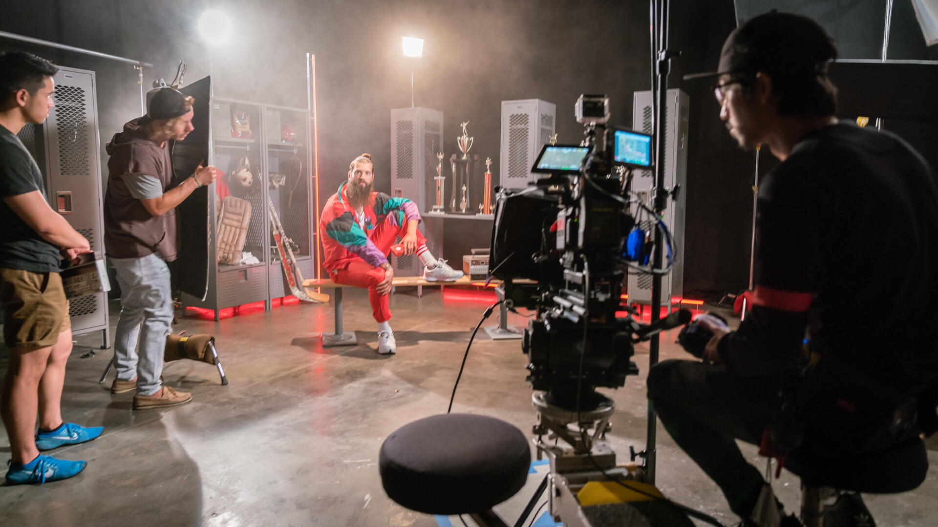
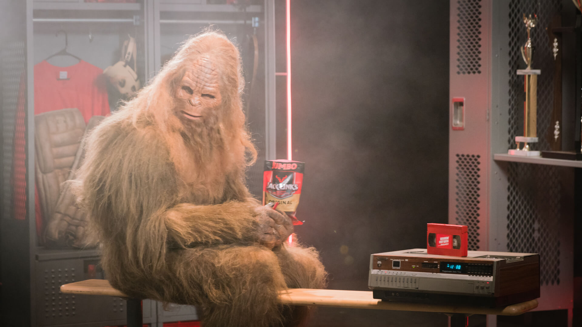
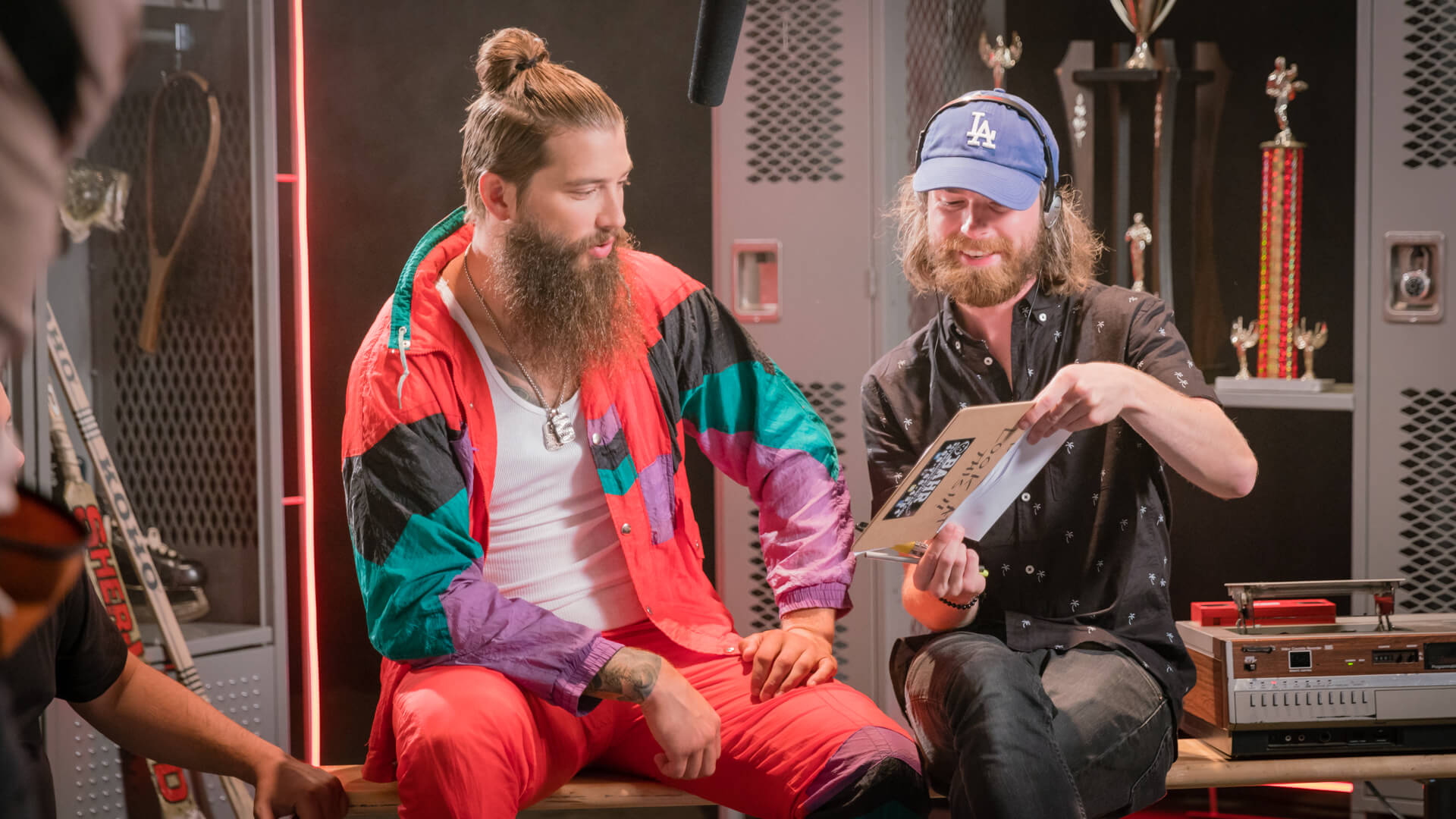
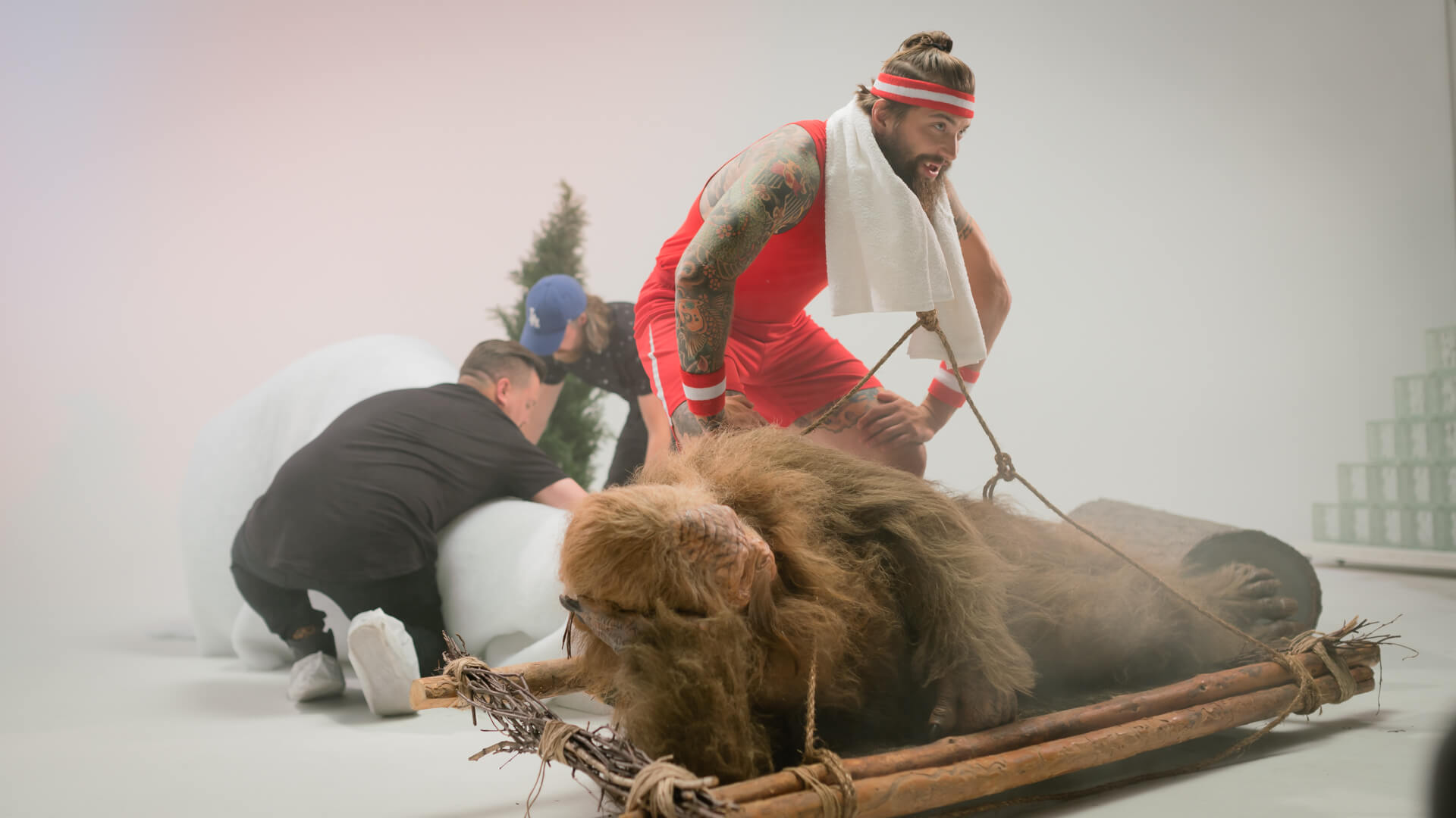
Sometimes they’re dingy, other times they feel a little homey, but what’s for sure is that we can all remember the rows and rows of lockers from our days as students. With a little bit of set dressing, one of the corners in our studio became an instant locker room. Set up against duvetyne draping, realism was created by setting up lockers, hockey accessories, and a bench. For that extra touch, San Jose Sharks defensemen Brent Burns was the on-camera talent with Sasquatch.
An Indoor Forest
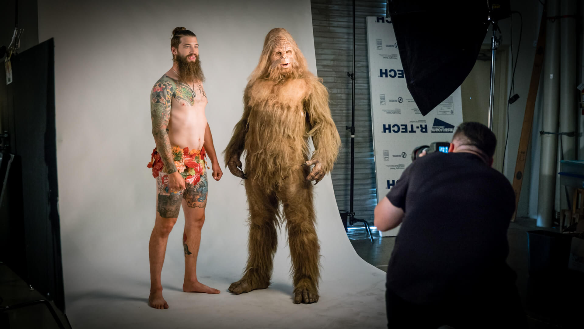
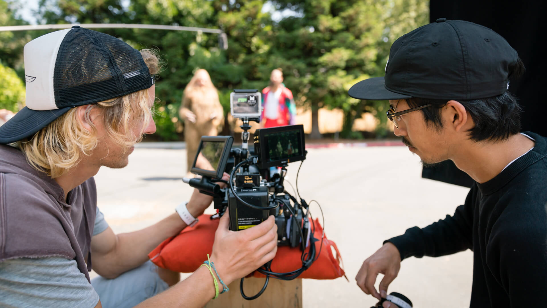
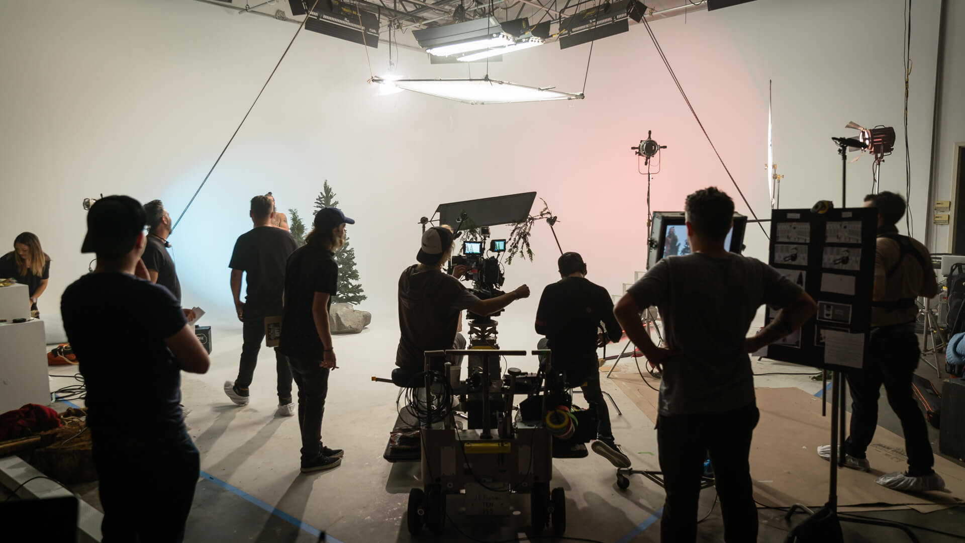
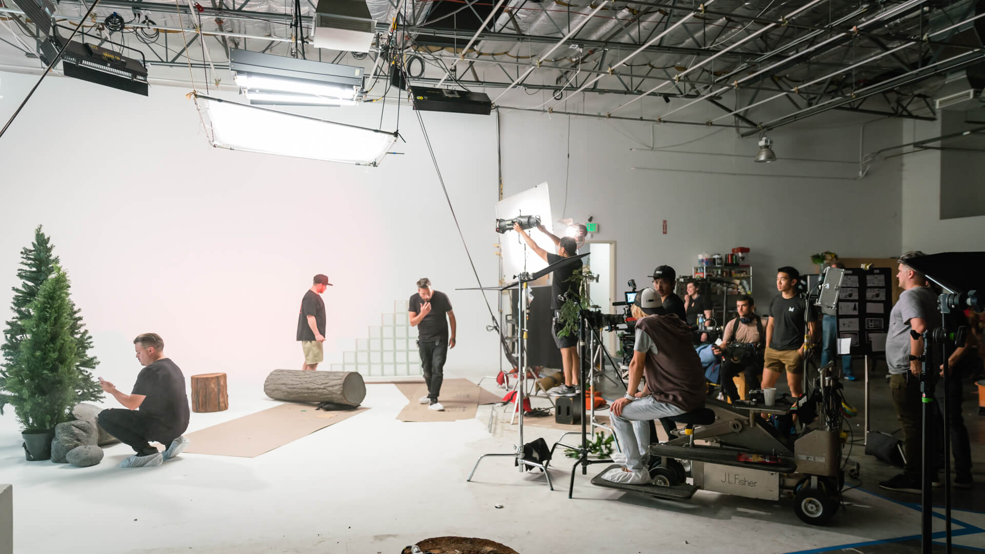
What we find most exciting about renting out our studio is how a production uses the space. All projects are different and each has their own ways of creating their reality. With a 180˚ spin of the camera, we transported to a different set. So how does a white cyc become a forest? With a real pine tree, some logs and rocks. The art department took the liberty of adding set pieces that weren’t authentic, but that’s the beauty of creating something that’s unique to a project and giving it an aesthetic.
It’s All About The Aesthetic
The aesthetic is an integral part of creative work. It’s what defines the project. It’s what makes it unique. The Jack Links commercial wouldn’t have had the charm, the quirkiness if it filmed in an actual locker room and forest. The practical locations would have given it a much different feel.
There are times when the practical makes sense for a project, at other times thinking outside of the box is the best approach. There’s never one direct way to a final deliverable, but we can all agree it’s the imagination that initiates a project that sets the journey in motion. In the case of Jack Links, the abstract approach was the best aesthetic for the project.
For a future project, we encourage you to develop out of the box ideas for your clients. It’s those types of ideas that will distinguish an average video from a superb video. Be whimsical. Be progressive. And don’t be bound by convention. Just look at what this crew did in our studio!
Behind The Scenes
* Cheers to Hayden Currie (director), TJ Derry (director of photography), Jack Babcock (producer), Ben Motz (creative director), and Luke Kimmond (creative director) who all did an amazing job on this project!
